

Excel makes it easy to make pivot charts! In this guide for beginners, we'll teach you how to use Excel's tools and features that will help you create the perfect pivot chart every time.
One of the best ways to analyze data in Excel is with a pivot chart. Pivot charts are designed to make data easier for users to understand, which makes them perfect for those who may not have much experience navigating Excel or other software.
It’s undeniable that pivot charts are Excel's most powerful chart type. They're highly customizable and interactive, allowing you to stay on top of your data with minimal maintenance needed. This is why you need to learn how to make them.
How to make a pivot chart in Excel in 8 easy steps
In this guide, we'll show you how easy it can be to create and use pivot charts with just a few simple and digestible steps!
1. Open your Excel workbook
First, you need to open the Excel workbook that will serve as your data repository. If there isn't one yet, simply create a blank document and get started on entering some content! After all, without it, what's even the point of creating an awesome pivot chart?
2. Create a pivot table
To create a pivot chart, you first need to have access to appropriate data. You can create this in the form of an organized pivot table. We’ll use one as our example! If you don't happen to have a pivot table already made, then go ahead and make your own by following these steps:
- Select every data cell in your sheet that you want to include in your future pivot chart. This will be used as your pivot table.
- Switch to the Insert tab in your Ribbon, and then choose PivotTable. A pop-up window will show up on your screen.

-
Select where you want your pivot table to be placed. You can either place it somewhere in your workbook, or create a new workbook for it. When done, click OK.

- Customize how you want your pivot table fields and other filtering options.
3. Create a pivot chart
With the Ribbon interface on top of the Excel window and switching to the Insert tab. You can insert a variety of pre-made charts, graphs, tables and even illustrations.
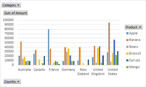
However, for this guide, you’ll have to find PivotChart in this list. It should be near other chart types which will open with just one click from your mouse once found. If you’re having trouble locating it, check the image above!
4. Select the pivot chart range
The first thing you'll see in the dialog box after choosing your data is "Choose what to analyze." You can select ranges, create a chart from external sources or choose another available option based on your Excel version.
Again, if you want to, you can change the output of the finished pivot chart to a new workbook, or place it somewhere in your current one. When you’re done, click OK.
5. Add filters to your pivot chart
With so much data and information available, you need an interactive way to organize it. With the help of filters in pivot charts, you can see only one category at a time making your work more dynamic!
There are many options for you to explore and sort your chart with. Take this as an opportunity to be experimental — if there is a mistake, don’t worry; the Undo command will always help! Just press the Control (or command on a Mac) and Z keys together.
6. Customize the pivot chart type
You can change your pivot chart type at any given moment. You might want to switch the type of chart you're using for different scenarios, or even just because it's more engaging - that’s totally up to you!
- Select the pivot chart you just created and placed in your workbook, or created a new workbook for. You can do this by simply clicking on the chart once.
- Switch to the Design tab in the Ribbon interface. It’ll become available after a chart has been selected.
- Click on the Change Chart Type button, which is found under the Charts subcategory. There are a variety of chart types to choose from in this menu and it's fun to experiment with them all!
- Choose your desired chart type then click OK. You’re all set!
7. Customize the design of your pivot chart
With the Design tab, you can easily change how your pivot chart looks. You may choose from a set of pre-made styles or even customize colors and fonts yourself to achieve an individualized look for any project!
By simply selecting our pivot chart in the ribbon's Design tab, we are able to quickly edit or modify its appearance with ease! We have access to a variety of different themes - both preset and customizing color schemes as well as font types ourselves is entirely possible too.
8. Save your pivot chart
To save your pivot chart, all you have to do is click on File and then choose Save as. You can overwrite the last saved version of your workbook by clicking on File again and choosing Save.
Alternatively, if you want a new copy of it under a different name or in an entirely different format such as PDF for printing purposes only, select other file types from within that menu before saving.
Final Thoughts
A pivot chart is the most powerful and versatile type of an Excel chart. They’re interactive, easy to manipulate with minimal maintenance needed. This makes them perfect for anyone who wants to stay on top of their data without wasting time fiddling around in Excel all day long.
We hope these steps have helped show how useful they can be in everyday business life! Check out our blog for more information about how we use them here at Eksoftware as well as some additional resources if you want even more guidance from experts like us.